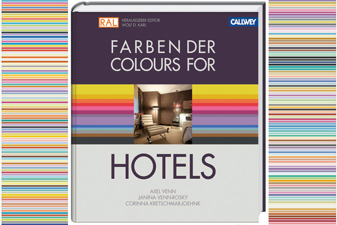
International interior design studio, JOI-Design, has released its third book, Colours for Hotels – a pioneering reference guide exploring colour theory for the hotel industry. Following the success of the firm’s first two publications – Raum.Werte.Creating Hospitality Design and 101 Hotel Rooms – Corinna Kretschmar-Joehnk, co-managing director of JOI-Design, conceived the new book in partnership with Professor Axel Venn, an expert in colour physiology and psychology, and trend researcher Janina Venn-Rosky.
As the first academic study to specifically investigate colour design for hotel environments, its content is based not only on JOI-Design’s extensive interior design experience, but also on research conducted especially for this report. Corinna explains: “Under the guidance of Professor Venn, colour collections have been intuitively labelled with phrases such as ‘international’, ‘nostalgic’, ‘luxurious’, ‘discreet’ and ‘plain’ to express the inherent spirit of each palette. We call these compilations JOI-Colours.”
The 448-page book includes 120 terms supported by their associated hues, colour maps, and concepts, alongside concrete examples of their application through a wide range of hotel scenes. In addition, RAL, the most popular guideline in Europe for colour standardisation, is planning a corresponding colour fan to accompany the book. Professor Venn also will be using the results from these experiments for the latest edition of his industry-endorsed colour dictionary.
Research was conducted through a series of test groups involving a wide range of ages, personalities and professions. Using a lexicon of adjectives selected for their tendency to evoke emotional responses, participants translated their feelings about the phrases into painted watercolour samples. Contributors were free to create the shades and patterns they felt best represented each word within 8 x 8cm squares. Once all the samples were complete, Axel and Janina examined each square one-by-one, objectively assessing the hues, shapes and percentage of colour value in each image using proprietary software honed over years of research.
The overall results were then collated, enabling the researchers to observe where there was strong agreement amongst the participants as to the correlation between certain colours and words. This analysis formed the basis for the book’s RAL charts, which rank 240 of the most important colours for hotels according to relevance and significance – although hundreds of additional nuances are illustrated throughout the chapters.
These codified palettes are spread throughout the book’s six chapters which identify major themes within hotel design: luxury, regeneration, family oriented, dreams and poetry, destinations for connoisseurs and bohemians, and those created with distinct regional styles. Within each chapter, adjectives are grouped into sets of four based upon the similarities shared by their associated colours. Colour maps provide detailed explanations of the analysis of each phrase as well as the individual paintings which support it.
In addition, a wide variety of furnishings and fabrics illustrate the colour concepts, with the manufacturers listed in the index, providing readers with a practical resource in order to weave these ideas into their own designs.
Corinna adds: “By venturing into this groundbreaking territory, we have created a unique and valuable reference for a wide range of readers – from interior and graphic designers to architects, project developers, investors, operators hoteliers and students. As the first book of its kind, Colours for Hotels unravels the instinctual associations made between words, feelings, shapes and colours, to provide fascinating insight into the way this synaesthesia shapes the atmosphere of hotels.”


